Chris Pappan explores new media and loses none of his complexity

As so often happens, life takes you on a detour and before you know it half a year has gone by without us showing this blog any love. For that we’re sorry. A lot of exciting stuff has happened in the art world in the meantime and my drafts folder is full of unfinished reports on events and exhibitions from the past summer that never made it onto the blog. 

Let’s see if we can get this ol’ blog back on track, shall we?

It´s no secret that Kiva Gallery are big fans of Chris Pappan, so we thought it worthwhile to give a little recap on what Mr. Pappan has been up to as of late. It’s been a busy summer for Pappan. He has been involved in two big projects in his hometown Chicago. Both projects are noteworthy insofar as they allowed Pappan to work with media that are new to his practice and on a bigger scale than usual. Pappan is, of course, famous for his precise ledger drawings with a twist – they are often slightly deformed and perspectivally askew (we’ve written about that at length here). It’s exhilarating to see what happens to Pappan’s core aesthetic when he tries his hand at a new medium. Both of Pappan’s Chicago projects were developed in dialogue with the city. The first was a collaboration with The Floating Museum – a Chicago initiative that aims to turn sites of Chicago into art spaces. For this project they utilized the Green Line of the city’s transit system. The idea was that passengers could view site specific art from the train while in motion but also engage with new cultural spaces through the various stops along the line. In his contribution, Pappan collaborated with artist Monica Rickert-Bolter to construct a 25-foot inflatable sculpture entitled Founders. The sculpture consists of the heads of four non-white figures who have been of historical importance for the city of Chicago. The figures are Harold Washington – the first black mayor in any American city; Jean Baptiste DuSable –  the founder of Chicago; his wife Kitihawa; and a bust by African American artist William Artis.
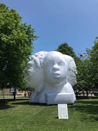
 

I think the concept of inflation is what makes the sculpture line up so neatly with Pappan´s previous preoccupation with the idea of distortion. In his ledger drawings, Pappan uses visual deformation in his depictions of sometimes stereotypical Native American imagery to suggest that what we see is a distorted truth. The meaning is conveyed by the technique he chooses. Similarly, in Founders, much conceptual weight is imparted through the very act of inflation. The stated ambition of Founders was to highlight historical figures that elevate the stories of indigenous people and people of color, honoring the often-overlooked roles they’ve had in shaping our contemporary world. 

The effect and signification would not have been the same had the sculpture been executed in another medium. Consider a stone statue of the same four figures. The very medium would suggest something rigid – perhaps that the figures are eternally present to the public. However one wishes it be so, it could hardly be said to be an accurate account of their historical standing. A sculpture that has to be inflated, on the other hand, conveys that it takes an effort for it to get into public view. Moreover, it lends an air of impermanence and fragility to the sculpture that underscores how easily non-white people fall out of historical view. 
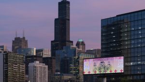
Pappan’s other Chicago-specific project was conceived within the frame of Expo Chicago – an art event taking place in September each year. A part of Expo consisted of Override – a project that let artists take over billboards throughout the city. Pappan’s contribution was Ghost of Route 66 – an image of three central Native American figures wrapped in blankets, flanked by two outlined (ghostly) repetitions of the central figures. 

The large image looks completely awesome against the backdrop of Chicago’s high-rises and office buildings. But taking into account the large, commercial format of a billboard, it feels inadequate to dismiss the image with an Instagram-friendly “awesome!”.  

Seeing three stoic Native Americans within a space usually reserved for the purpose of advertising goods and services to be sold is an emotionally complex experience. This complexity has always been Pappan’s “hook” and what sets him apart – things are never quite what they seem; there are dimensions and layers; subtexts and buried meanings.

These most recent works of Pappan bring forth the complexity in a triumphant new scale and we hope to see more of it.        
Jeffrey Veregge’s love of comics


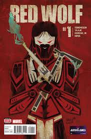
A lot of folks these days are looking forward to Avengers: Endgame. I know Jeffrey Veregge is one of them. Here’s a clip and an article of Veregge talking about his love of comics, which hasn’t always been easy.   It is a love that has often been mixed up with frustrations over the negative representation of Natives in comics. However, Veregge has recently had a chance to himself rectify some of these misrepresentations.  When Marvel rebooted the Native American character Red Wolf, Veregge was brought on board to steer the character clear of the stereotypes it has been attached to in the past. He devised the character in the style that has become his trademark – incorporating the traditional formline art technique common to his reservation Port Gamble S’klallam in Washington into the overall design. 


Jeffrey Veregge is still on view at the Smithsonian with a large superhero- themed mural.  


Interview with Daniel McCoy

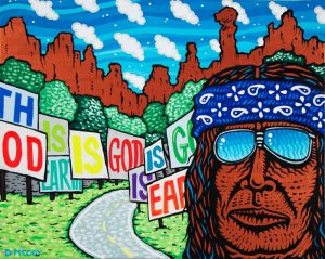
Long interviews where the artist gets to tell his or her story are always a privilege. Here ’s a new one with Daniel McCoy . It’s a good talk and I highly recommend you give it a read to learn all about McCoy’s fondness for Death Metal typography, cartoons, and food logos. He also talks in earnest about the struggles of the art world  – financial and other –  and the fear of it affecting the art. 

How contemporary Native American artists counter cultural appropriation with artistic appropriation

Google “Native American appropriation art” and the first five pages of results or so are all about negative cases of cultural appropriation. On these pages we can read about how outsiders misuse Native American images and cultural heritage, such as the infamous feathered headdress on a lingerie clad model in a Victoria’s Secret show five years ago. Cultural appropriation, of course, continues to be a problem and something that should be addressed and discussed. However, when typing in that search term I wasn’t looking for Native Americans as victims. I wanted to read about how appropriation is used as a strategy within contemporary Native American art. I was looking for Native American artists as agents of empowerment. To find such results buried under droves of articles about how Native American iconography has been mistreated must feel like a double slap in the face. First whites steal Native cultural practices and use it in a distorted way, then this act of appropriation steals the attention away from Native artists who use appropriation as a way to symbolically fight back.

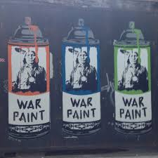
This makes it very difficult to place the aesthetic tactics of many Native American artists into proper art historical perspective, which is a shame, especially considering how significant appropriation is for many Native artists. Appropriation is, after all, a genre of contemporary art that has perhaps been the most important hub for questions concerning artistic authorship and originality and the contextual relativity of the meaning of images. It is perhaps within the Native art community that the legacy of appropriation art today finds it’s firmest stronghold. At first sight it may come as a surprise to learn how popular Andy Warhol is in this community. I can tell you that it is not because of his “Cowboy and Indian series”, but rather because of how Warhol demonstrated that the specialness of a sign – for instance a Campbell’s soup can – can be emptied by the act of repetition and how the meaning of a pre-existing image or object can be altered by placing it within a new context.

Warhol himself was not a particularly political figure, but the strategy of appropriation, of “copying” images and making them your own, has a history of political uses.
Dara Birnbaum and Sherrie Levine used appropriation to feminist ends. By repeating and recontextualizing imagery by male originators they questioned the authenticity of representations of gender. Appropriation has also been employed to question the commodity value of art and its underlying economic structures.

Even before it was a genre of art, Raphael Montanez Ortiz performed a case of appropriation aimed at exposing the misrepresentation of Native Americans. In 1957 he used a Tomahawk to chop up Anthony Mann’s western Winchester ’73. He then put the pieces back together at random, resulting in a complete scrambling and disruption of the original narrative. “Ortiz considered his shaman-like process resonant with his indigenous heritage. His destructive act also criticized media depictions of Native Americans.” 

As a genre, Native American appropriation art comes across as something self-evident and completely natural. Artists are simply taking images back that were stolen from them. Artists such as Douglas Miles, Jaque Fragua, Steven Paul Judd, Ryan Singer, among many others, consider appropriation a way to take repossession of images that they have lost control over. In short, one might say that appropriation art is a means to combat cultural appropriation.

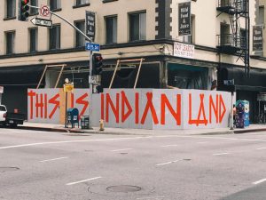
We’ve written about the importance of graffiti for contemporary Native artists many times here on the blog. In the hands of Native artists, painting with spray cans in public spaces is no petty act of vandalism but a profoundly political gesture. This is clearly demonstrated by Jaques Fragua who wrote “This Is Indian Land” in giant letters on a construction site in Downtown Los Angeles. The act of appropriation is performed in a spirit kindred to graffiti. For Native American artists it is about re-claiming what is rightfully theirs by symbolically taking back their land by illegally writing on it, or redefining images that have been made from an external point of view.

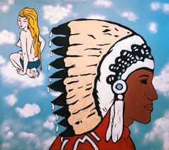
We haven’t written about Jaque Fragua on the blog before, so let’s continue on him. Besides graffiti, Fragua considers appropriation one of his artistic go-to’s. “The Big Chief” is for instance a commercial symbol that has become a recurring character throughout Fragua’s work. Fragua explains: “He’s a chief from a sign that’s near my reservation, at Big Chief Gas Station. If you’ve ever watched Breaking Bad, you’ve see that gas station. I lifted him and I’ve been putting him everywhere—he’s the Big Chief, right? When you put a mirror against another mirror, you start seeing the core of the truths.”

In another interview, Fragua explains the appeal of appropriation more in depth: ”Simply, it’s about imagery that continues to colonize us. By creating fine art out of these visuals and emphasizing the images ad nauseum, it creates the opposite effect. Sort of like Warhol’s soup cans.”  Fragua thus reappropriates his culture’s iconography in a way that conceptually subverts our overconsumption of misappropriated Native American images that has turned into stereotypes.

Some critics fear that appropriation as a artistic gesture has lost some of its meaning in a time when borrowing, quoting, stealing and copying is everyday practice to the point of being ubiquitous. However, for Native American artists, appropriation simply follows the rules of the game set by a white hegemony. It is the answer to a signifying practice already put in place. As such, appropriation is important now perhaps more than ever. With a president that casually refers to people of Native American heritage as “Pocahontas”, and a culture at large that hold it’s racial stereotypes dearly, appropriation as artistic weapon offers a way to strike back. Contemporary Native American artists turn to appropriation not to be trendy or edgy but out of urgency. It opens a line of dialogue that lets Native Americans have the last word on images that they were not in charge of in the first place and thus to let the public know what they think about them.

Further reading about cultural appropriation:

https://unsettlingamerica.wordpress.com/2011/09/16/cultural-appreciation-or-cultural-appropriation/

https://jezebel.com/5959698/a-much-needed-primer-on-cultural-appropriation 

http://nativeappropriations.com


About appropriation art:

https://www.artsy.net/article/artsy-editorial-the-art-of-copying-ten-masters-of-appropriation

https://www.thoughtco.com/appropriation-appropriation-art-183190 

“Okay, I think I can do that”: How to look at art and get inspired to do, well, just about anything.

There are days when you don’t have anything in particular to report – no news and no opinions. Some days you just want to write about something that makes you feel good. Something to inspire you to get off your ass and do stuff. Something in the “hell yeah!”-vein, in other words. This is one of those days. There are many things I love about Native American Art, but there is one thing in particular that keeps hold on me and it’s something that runs deeper than surface aesthetics. It is a certain attitude that shows you how powerful art can be. Art can give you a voice when other means of expression are suppressed. It is hard to find that attitude elsewhere, at least so collectively concentrated. The realization that art can show reality but also create another reality is what makes so many Native communities bubble with creativity.

The rapper Drake said in the song “Fireworks”: “from the concrete who knew that a flower would grow”, meaning that it is surprising that beauty could come from harsh circumstances. He clearly has no concept of Native Art. Or, to take an example closer to Drake’s own rap identity – New York’s graffiti culture in the late 1970s and early 80s. There is a lot about that era that reminds me of the contemporary Native art scene. That period is all about the creative ways of the disenfranchised to grow out of the concrete. Spraycan graffiti was a completely invented art form so there were no art schools to teach you how to do it. Ghetto kids were the professors and their education was on the streets where the tricks of the trade were passed from peer to peer. At the beginning there were no commercial ambitions- the practitioners had yet to find a way to monetize their art. It was just about rising above the everyday struggle by creating something beautiful and spreading it throughout the streets.
Art is empowering. It let’s you create and define your own world. When the realization of this occurs on a collective level, like with graffiti in 1970s New York, art is injected with an energy and enthusiasm that is highly intoxicating and convincing. Similarly, a lot of Native Americans today latch on to art as a source of optimism and tool for change.

I’m writing these words with one particular artist in mind: Steven Paul Judd. Few people embodies the DIY – attitude like Judd. He embarked on his artistic trajectory when trying to find some nice Native art to hang in his house. He failed to find anything that corresponded to his taste for pop art, so he simply set to work making some himself.


It is no accident that Judd has close ties to graffiti culture. But labelling Judd just a graffiti artist would be reductive. Creativity just pours out of him and into every facet and category of art. This guy is just pure inspiration, in the truest sense of the word. He has no proper education in the arts so he doesn’t always know the ”hows”, he just knows that he has to do it. And a lot of the times, Youtube tutorials will get you where you need to go. The quote in the title to this piece, of course, comes from Steven Paul Judd. And the mentality of going for it runs through his entire practice of art.

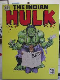
Not least it applies to his approach to historical iconography. Judd quite often uses familiar imagery but in a way as to make it more Native-centric. He uses art to create his own alternate version of pop-culture, for instance by fusing historical Native American iconography with the world of Star Wars, or by recasting superheroes such as The Hulk as Native American. Claiming your space in this way, despite what history and the powers that be say, is a deeply graffiti-like attitude.

In an interview Judd talks about his creative process in a way that seems to be representative of his energy and eagerness to get things done. Recently, Judd has been creating portraits of Sitting Bull, composed entirely out of Rubik’s Cubes. Which is like building a complicated puzzle, with smaller puzzles for pieces. The initial plan was to mount it on the wall but he finished the puzzle before he had figured out a way to fasten the cubes on the wall. So he just let the cubes lay on the floor, the art work now an installation rather than a wall piece.

If there’s a will there’s a way, I believe is the accurate motivational phrase here.
To continue in this vein of self-improvement, let us sum up by making it a rule that whenever you feel that things are just too damn hard, ask yourself: what would Steven Paul Judd do? If the conclusion you come up with is not “Okay, I think I can do that”, you’re doing it wrong.

How Star Wars has inspired Native American art.

Yesterday marked the 40th anniversary of the Star Wars franchise. What better way to celebrate than to show some examples of how Star Wars has appealed to Native artists.
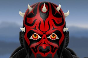
Besides a notable similarity between traditional Hopi hairstyles and how Princess Leia wears her hair, as illustrated by Nicholas Galanin, Star Wars has little direct relevance to Native culturRyanSinger the new ambassadors, 2015e. But of course Native peoples watch movies too. And the classic tale of good triumphing over evil seem to hold something different for everyone to identify with.
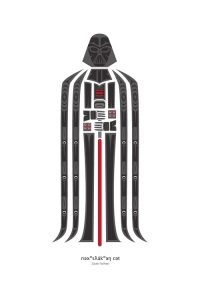
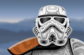
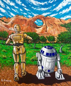
Navajo artist Ryan Singer, represented by Kiva Gallery, relies heavily on pop culture in his painting so it’s a small surprise that he has devoted a series of recent paintings to Star Wars. Singer explained the attraction in a radio interview:

“as I got older I started to, kind of like fusing pop-culture imagery with the Navajo culture. Somehow that Star Wars just, kind of like, manifested in there. And, I always thought of Tatooine as the desert that was close to Tuba City where I grew up, and the Sand People nomadic people real similar to how the Navajos were. So, there were all these similarities I saw in the movies. There really is, like sort of, two different worlds, you know, as far as culture. I try to bring them together and mix them up.”

The imaginary movie posters of Jeffrey Veregge has been featured on the blog before. Veregge depicts familiar Star Wars motifs and characters in the artistic style inherited from his Port Gamble S’Klallam Tribe.


Shes_Got_it_where_it_countsJVDark-Father


A few years back, Andy Everson did a series of Star Wars – themed paintings that had a political twist. In Everson’s hands, Star Wars battle of light and dark was referenced in order to address political concerns amongst his own tribe.

images-9

o-STAR-WARS-NATIVE-STYLE-facebook


Steven Paul Judd specializes in “impossible” encounters of pop-cultural icons with Native American history. His photoshopped juxtapositions are often strikingly
funny but also remarkable for demonstrating a missed encounter and the exclusion of Native culture from mainstream pop culture.

images-11

Excluded or not, the above artists have all taken something they like and made it their own, even though the original content has no explicit relation to their culture whatsoever. I don’t want to read to much into this, but in a way I find the interest in Star Wars encouraging. It demonstrates a DIY approach to inclusion. Looking at these images I feel  – If I may allow myself to partake in Star Wars geekiness and reference the revised subtitle of the very first Star Wars movie –  A New Hope that Native culture may take a bigger slice of pop culture one day.

Standing Rock and Artistic Protest


images-6

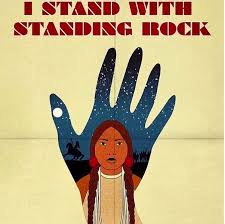
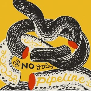
If nothing else, we can be grateful to President Trump that there is more political art and music now than we have seen in a long time. To realize that art flourishes in times when there is much too protest about you only need to scroll through your daily Instagram feed and look for Trump-related posts. The aspect of his presidency that has perhaps sparked some of the most thematically specific art concerns the pipeline in North Dakota. When Trump reversed Obama’s cancellation of the completion of the pipeline through Sioux territory, art became a central component in the protests against it. Now that the protesters have been evacuated from their camps and work has begun to finish the controversial pipeline, the artistic protests that are still being produced proves that the struggle is far from over.

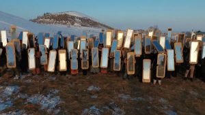
One of the more effective artistic interventions into the conflict was Cannupa Hanska Luger’s mirrored shields. Using cheap masonite and adhesive mirrors, Hanska Luger crafted shields that were passed out among by the protesters. This, however, was more than an act of rearmament to match the equipment of the police who often carry shields at demonstrations. According to Hanska Luger the reflective surfaces on the shields would reveal to the policing forces the shared la-cmiranda-1482896132-snap-photohumanity “underneath their uniforms—and [make them] realize that they are also on our side” (http://theartnewspaper.com/news/artist-creates-mirrored-shields-for-standing-rock-protesters/). The shields thus function as protection against bodily harm but also as a peaceful deterrent to any kind of violent confrontations.
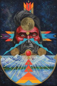
The shields were also used in a performance that can be seen here:  http://www.freep.com/story/news/local/michigan/2016/12/04/hundreds-mirror-shields-used-standing-rock-art/94961662/

Cannupa Hanska Luger explains the role of the artist: “Artists, we live on the periphery. But we are the mirrors. We are the reflective points that break through a barrier.” (http://www.latimes.com/entertainment/arts/miranda/la-et-cam-cannupa-hanska-luger-20170112-story.html)

That is the power of art in times of conflict. It is more than just a polarized opinion that can easily enough be dismissed by those who take the opposite stance. As such, it has the power to break through barriers. Here is some more art that tries to do just that.

0d5bb420509d9356f7edd5de48a1d3d1

Kenzie Townsend


images-3347f3896606f865e4a7e02dc059e8216

Mateo Romero solo exhibition

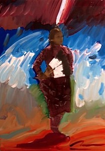
After a hiatus here on the blog we are back to proudly announce that Kiva is hosting a solo exhibition of the work of esteemed Cochiti Pueblo artist Mateo Romero. Romero gained recognition in the early 1990s for his Bonnie and Clyde painting series which depicted native youth at leisure. But as the title suggests, the scenes were often shot through with a dark undercurrent, touching on sensitive subjects such as domestic violence and alcohol abuse. Since then Romero has developed his technique to include photography into the painting process. The style creates a stark juxtaposition of each medium’s respective effects. Photographs are scanned onto the canvas and the details of the photographic image are contrasted by Romero’s expressionistic brushwork, creating abstract lines of color around the portrait-like figures. The dynamic is particularly evident in the Dancer series, which depicts subjects engaged in ceremonial dances. The photos are static, yet Romero tries to capture the motion and spiritual elevation of the dances through swirling brushstrokes and bright colors.Bild 4 kopia

Romero explains his technique in these words:

“These paintings reflect a pattern of evolution and change. The images are powerful, imposing, juxtaposed with swirling gestural paint marks and drips. Timeless, archaic elements of Pueblo culture are juxtaposed with contemporary abstract expressionist palette knife and brush work. Overall, the paintings develop a rhythmic, hypnotic, trancelike feeling which is referential to the metaphysical space of the Pueblo and the dance itself.”

The exhibition focuses mainly on Romero’s mixed media paintings. The centerpiece, however, is a mixed media painting but with tar instead of photography. “Lonely Soldier” (2012) shows a silhouetted figure – it’s features completely blacked out – holding a raised rifle against a semi abstract landscape. It belongs to a series of paintings that takes the massacre at Wounded Knee as its theme. It is a powerful image but also a somber one. The way it plays with positive and negative space literally turns the potent figure into a black hole. While capturing a moment of proud struggle, the scene is also permeated with retrospective knowledge of the tragic outcomes at Wounded Knee.

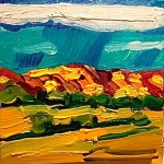
Bild 5Most recently, Romero has returned to pure oil painting. The exhibition includes three landscape paintings that verge on abstraction through broad, colorful and expressionistic brush work that infuses the scenery with a vibrant energy.

In some paintings of his recent output, Romero has returned to the Bonnie and Clyde theme of his early Bild 1paintings. One mixed media painting included in the exhibition bears the title “Girl with a Gun” (2012).

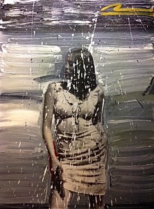
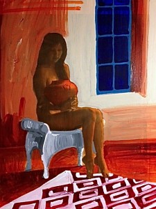
It shows a stylish young woman in a short dress clutching a handgun against her bare thigh. Despite the seemingly violent subject matter, the impression one gets from the painting is not exactly hostile. While the source of violence is front-and-center, its’ importance is downplayed by how casually it is handled. The handgun has become just another object, almost a fashion accessory. Other images are more peaceful. In two of the paintings in the exhibition a woman sits posed in contemplative absorption whilst holding a piece of pottery in her lap.

Bild 8 Like many other contemporary native artists, Romero’s art frequently emphasizes a connection to the past. In this light the pottery and the handgun may not be as far removed from each other as it may seem, but rather represent two sides of the same coin. Maintaining an authentic artistic tradition in the face of institutionalized marginalization is tantamount to an act of resistance; a resistance to being swallowed up by mainstream culture. And Romero’s art resists while immersing the viewer in a joyful dance of color and paint.