Wendy Red Star at Newark Museum

Wendy Red Star is one of the most exciting contemporary artists at the moment. There was recently a feature article in Vogue about Red Star which is a clear sign that she is hot stuff in the art world right now. Moreover, she has a solo exhibition at Newark Museum. It is an extensive exhibition that covers her production from 2006 to 2019 and includes more than 40 of her works. 

Red Star has tried her hand at many different mediums. Some, such as weaving, she uses because of it’s traditional link to the crafts of her reservation – the Apsáalooke (Crow) in Montana. But it is perhaps her photographic work that has drawn the most attention.  Red Star often uses herself as subject and model in her photographs. 

A recurring theme for Red Star’s art is the politics of identity and memory. 

Many of Red Star’s works utilize strategies and methods found in conceptual art. “My Home is Where my Tipi Sits”, for instance, echoes Bernt and Hilla Becher’s photographic typologies. But a still more significant influence is arguably the “theatrical” trend in 1980s art. The staged quality of Red Star’s work can be traced back to artists such as Cindy Sherman, Laurie Simmons, Robert Longo, Richard Prince. 
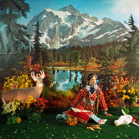
These artists used strategies of theatricality and artifice to explore the manufactured nature of various identities. As does Red Star. But when she employs similar strategies she needs them to convince more than the artists above. That’s because the figure of the Native American is arguably surrounded by some of the most rigid stereotypes there are. In the series “Four Seasons” (2006) Red Star examines and seeks to undermine the image of “the natural Indian” – a Native American with a privileged bond to nature and to earth. As evidenced by Disney’s Pocahontas, the illustration for the butter Land o’Lakes and countless posters, album covers and posed photographs, there is such a shortage of Native American artists and cultural commentators with a strong voice on the international stage, that these stereotypes are often allowed to continue to shackle Native identity. Many whites hold their stereotypical notions dear and are profoundly invested in the view of the Native American as holder of the secrets to nature. 

As Daniel Larkin explains:

This romantic, and generic, image of the American Indian as spiritually connected to a bucolic earth has inspired many non-Indians to make trips to reservations, visit museum exhibitions, partake in rituals, and read texts associated with the many different indigenous peoples of North America. However, this romantic image can lead outsiders to cherry pick ideas from the diversity of American-Indian spirituality so that they fit into their preconceived, romanticized New Age schemas. 

What is particularly brilliant about Red Star’s photographs is that they look better than they actually are. What I mean is that, at first the images appear to unproblematically play into the hands of those with romanticized notions of Native Americans. What the viewer initially encounters is an adorned Native woman in a beautiful landscape, accompanied by animals. The image is so familiar and normalized that it is understandable if the viewer does not immediately spot the ”tells” that this image is fake, such as the suspicious creases in the landscape – which is actually a poster – behind Red Star. Or the blatant two-dimensionslity of the cardboard animals. Through this perceptual twist, Red Star’s images not only uncovers the artifice of visual clichés but also lay bare the viewer’s willingness to be seduced by them. 

Red Star’s staged photographs remind me a bit of that scene in Night at the Museum where Ben Stiller tries to have a conversation with Sacagawea through thick glass that mutes all sound. Red Star’s tableau’s are similarly characterized by disrupted communication. That Red Star now has a major exhibition in a big museum is fitting considering that museums and cultural institutions have often been major agents in perpetuating skewed ideas about Native Americans.  

Wendy Red Star´s mid career survey is on view at the Newark Museum until June 16, 2019
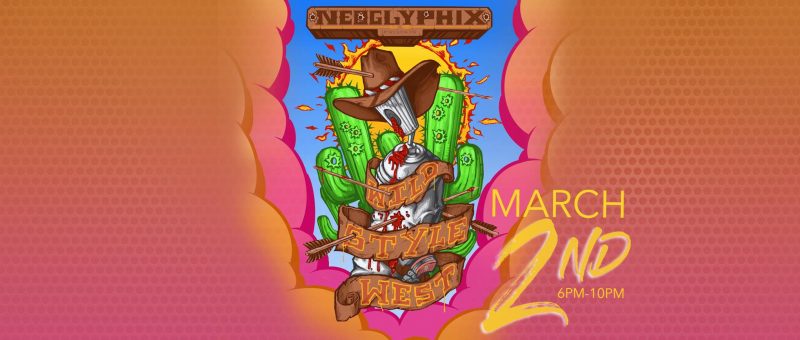
Neoglyphix presents Wildstyle West

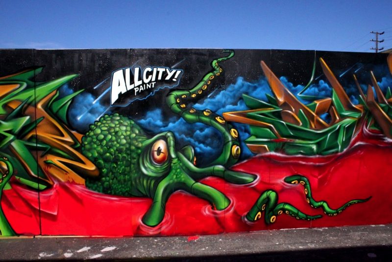
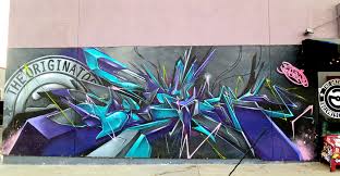
Coinciding with the Indian Fair and Market at Heard museum is another exhibition of Native art, this one with more of a street edge. Called ”Neoglyphix Wildstyle West” it features aerosol art by Rose Simpson, Douglas Miles, Dwayno Insano and Dytch 66, among others. I had to google the last two names and I’m glad I did, because both do some really impressive spraycan art. Below are some images I found. 

Dytch 66
Dytch 66


Dwayno Insano


Dwayno Insano


Neoglyphix Wildstyle West will open 2 March at Prime Cut  & Sew Barbershop and Boutique in Mesa, Arizona.

Patrick Dean Hubbell paints with dirt and makes ”almost” portraits

Patrick Dean Hubbell is a relatively young artist but his art feels mature. That’s a pretty cliché way to start an exposé of an artist you actually admire. Might even be a bit belittling. Sorry Patrick Dean Hubbell, I’m not good at intros! What I mean to say is that a lot of thought and consideration seems to have gone into Dean Hubbell’s art. I respect that. Now, to get through this introduction as smoothly as possible, let’s stick to some facts. Patrick Dean Hubbell is Navajo. He graduated art school 2010. He lives and works on the Navajo Nation in Window Rock, Arizona. 
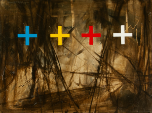
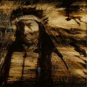
Dean Hubbell’s art is not easy to categorize. It is part disciplined geometric control and part total painterly abandon. It feels traditional and new at the same time.    

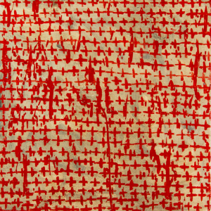
One gets the feeling that Dean Hubbell is somebody who follows his own path. But sometimes he veers close to others. One of Dean Hubbell’s main inspirations is Jackson Pollock. It was not a connection I had spontaneously made but when I came across a video of Dean Hubbell talking about his admiration for Pollock it made perfect sense. Pollock was, of course, famously inspired by Navajo sand painting, so Dean Hubbell’s admiration of him closes a circle of sorts. But that is only a superficial kinship. The spirit of Pollock can be traced deeper, in the way Dean Hubbell works and thinks about his work. In the same video, which can be seen on the artist’s webpage, we see Dean Hubbell crouched down on the ground, gathering soil from his native, Navajo land. He will use it as pigment for his paintings. Like Pollock, Dean Hubbell lays his canvas flat on the ground and proceeds to rub the processed reddish soil into the canvas. While being largely abstract, Dean Hubbell’s art in this way manages to address questions of belonging and identity in a way that goes beyond representation. There is something profoundly moving in knowing that the artist’s homeland is physically present when the viewer encounters the painting in the gallery. Such indexes of artistic presence can also be experienced in Pollock’s work, which sometimes includes cigarette ashes and footprints and whatever gravity decided fit for it’s pull.   


Important though his influence may be, I would say that Dean Hubbell’s affinity to Pollock is only half the story. For where Pollock welcomed chance and accident as part of his creative process, with Dean Hubbell there is often a force to counteract the uncontrolled and chaotic. With an eye for strong patterns and graphic clarity, Dean Hubbell’s painting often juxtapose Pollockian turbulence with geometric repetition. A definite favourite of Dean Hubbell’s is the zigzag, or chevron, pattern. I appears as a leitmotif throughout many of Dean Hubbell’s series of painting.    

Dean Hubbell likes to work in series and he handles the format like a virtuoso. The musical connotation of the latter term is intended in every way because within the context of the series each painting becomes different notes on the same theme, each contributing to the melodic whole. Another analogy is to film. The presentation of the series “Between Here and There” on Dean Hubbell’s website could almost be stills from a short, abstract movie in the tradition of, say, Stan Brahkhage. The series starts out with a strict chevron pattern against differently coloured backgrounds. After a few paintings, the pattern is upset and becomes looser and apparently  more and more haphazard. Eventually the pattern is all but dissolved into a flurry of coarse brushstrokes and abstraction. The pattern appears again, but this time more angrily, almost brutally.   

While each painting is completely spectacular on their own, I cannot stop replaying this series as a sequence in my head, and it is a trip!

Since we have opened the door to film, let us use some of its’ concepts to cast light upon another series. 

The series “Almost a Portrait” consists of obfuscated figures. They can be identified as Native American from their ceremonial clothing and other traditional markers of Native identity. Dean Hubbell states that the paintings are based on traditional portraiture and how those practices were seldom “in the best interest of” Native American peoples. There is indeed something “off” about these images. This impression is further supported by their “bad framing”. The framing makes it appear as if these were pictures taken by accident, as when the shutter goes off in between changing camera position. French film theorists referred to such “badly” composed images as “decadrage” which roughly translates as “deframing”. Some New Wave filmmakers consciously used deframed images as a way to make the spectator aware of the frame and more generally to reflect upon the constructed nature of representation. It functions similarly in “Almost a Portrait”. By literally pushing subjects out of the frame, these images signal that proper representation is not to be found here and that the truth lies elsewhere. "Almost a Portrait"
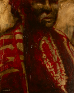
Patrick Dean Hubbell spent the whole of 2017 travelling around the Navajo Nation to collect earth pigment to use in his painting. Some of these paintings have been on displayed until recently at Peter’s Projects in Santa Fe.     


As one of the most exciting contemporary artists, Kiva Gallery can’t wait to see what Patrick Dean Hubbell will do next. Kiva Gallery is also proud to include a number of Patrick Dean Hubbell’s paintings in its collection.

Ryan Singer’s outlines

Like I’ve stated before here on the blog, Ryan Singer’s art is a glorious combination of 1980s era skateboard graphics, rock poster art, and comic books. 

Recently, Singer has taken his pop cultural obsessions to the next level by fusing iconic Star Wars characters with traditional Navajo milieus. In Singer’s paintings, Tuba City becomes Luke Skywalker’s home planet Tatooine and gigantic AT AT walkers can be seen marching through a wintery Shiprock, New Mexico. Somehow, the transformation manages to come off as completely logical. Ryan Singer can make the seemingly incompatible come together in a completely natural way. This is also the case in the paintings I want to put into focus today.  


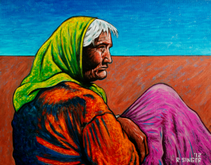
One of Singer’s stylistic trademarks is his use of heavy outlines. Of course, strong outlines are a big part of the low brow/comic book aesthetic that Singer has adopted. But they are rarely associated with scenes of a more solemn and introspective character. That’s why I’ve been very taken with two of Singer’s paintings in Kiva Gallery’s collection. One is of an elderly woman staring out of the frame into the unknown. The fact that the viewer doesn’t see what she’s gazing at has the effect of turning the gaze inward rather than outward. Singer’s traditionally thick line work underscores this experience. There is much emotional content that can be read into the effect of the outline. The outline is so heavy it makes her seem anchored to the landscape. At the same time it closes the figure off and makes her appear isolated from her surroundings. The landscape behind her is simplified so that the woman pops out even more, which makes it impossible for the viewer to ignore her introspection. This is one of those rare paintings that instantly catapults the viewer into pondering the inner life of a figure that came into being solely through paint. Like Leonardo’s Mona Lisa, the viewer can’t help but wonder “what on earth could she be thinking about”. Yes, I just compared Ryan Singer to Leonardo Da Vinci. The comparison is apt but perhaps not adequate, because in a way the contemplation in front of Singer’s painting is more profound than Mona-Lisa’s. This is after all a Native woman so you know she’s seen some shit in her days. More than the smirk on the face of her more famous art historical relative would suggest.  

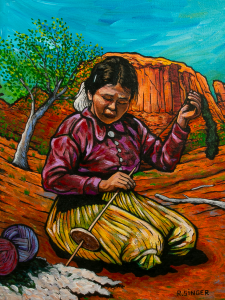
Kiva Gallery also has another Ryan Singer painting with an unusually serene mood. It is a deceptively simple scene. But if you allow it, the outline will tell a deeper story about time and stasis, tradition and generational renewal. Again, it’s a painting of a woman in a landscape. In contrast to the woman above, this woman is young. Her activity, however, is old. She is spinning wool. The landscape around her seems to respond to her activity because it curves around the girl almost to envelope her. But there is that thick outline again, tracing the contours of the girl’s body and shielding her off from her surroundings. It is almost as if the landscape is moving more than she is. A strong outline reifies movement rather than capture it. In a way it stops movement and freezes it which makes the experience of superhero comics, which are of course full of movement, deliciously paradoxical. The girl spinning wool seems remarkably still despite being caught mid-motion. From the perspective of her activity, time has stopped moving. The girl probably learned how to spin wool from her mother, and she in turn will teach her daughter. The activity doesn’t belong to her, she belongs to the activity that has existed before her and will continue to exist long after she is gone.  
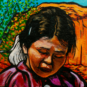
 

I’m very grateful for these paintings and proud to have them grace the walls of Kiva Gallery. While they are completely representative of Ryan Singer’s painterly style, the quiet subject matter makes at least this viewer more attentive to the function of his artistic techniques and the stories they tell.     

Nicholas Galanin mid-career retrospective at Heard Museum

Kiva Gallery loves Nicholas Galanin and thinks he is one of the most important figures in contemporary art, so we are excited to hear that Heard Museum will host a mid-career retrospective of his work. The exhibition will be titled ”Dear Listener” and run through May 04 to September 03, 2018. To my knowledge it will the biggest solo exhibition of Galanin’s work to date and will encompass more than 10,000 square feet of new and existing works by Galanin including video installation, sculpture, performance art, works on paper, installation work, and fashion.

How contemporary Native American artists counter cultural appropriation with artistic appropriation

Google “Native American appropriation art” and the first five pages of results or so are all about negative cases of cultural appropriation. On these pages we can read about how outsiders misuse Native American images and cultural heritage, such as the infamous feathered headdress on a lingerie clad model in a Victoria’s Secret show five years ago. Cultural appropriation, of course, continues to be a problem and something that should be addressed and discussed. However, when typing in that search term I wasn’t looking for Native Americans as victims. I wanted to read about how appropriation is used as a strategy within contemporary Native American art. I was looking for Native American artists as agents of empowerment. To find such results buried under droves of articles about how Native American iconography has been mistreated must feel like a double slap in the face. First whites steal Native cultural practices and use it in a distorted way, then this act of appropriation steals the attention away from Native artists who use appropriation as a way to symbolically fight back.

This makes it very difficult to place the aesthetic tactics of many Native American artists into proper art historical perspective, which is a shame, especially considering how significant appropriation is for many Native artists. Appropriation is, after all, a genre of contemporary art that has perhaps been the most important hub for questions concerning artistic authorship and originality and the contextual relativity of the meaning of images. It is perhaps within the Native art community that the legacy of appropriation art today finds it’s firmest stronghold. At first sight it may come as a surprise to learn how popular Andy Warhol is in this community. I can tell you that it is not because of his “Cowboy and Indian series”, but rather because of how Warhol demonstrated that the specialness of a sign – for instance a Campbell’s soup can – can be emptied by the act of repetition and how the meaning of a pre-existing image or object can be altered by placing it within a new context.

Warhol himself was not a particularly political figure, but the strategy of appropriation, of “copying” images and making them your own, has a history of political uses.
Dara Birnbaum and Sherrie Levine used appropriation to feminist ends. By repeating and recontextualizing imagery by male originators they questioned the authenticity of representations of gender. Appropriation has also been employed to question the commodity value of art and its underlying economic structures.

Even before it was a genre of art, Raphael Montanez Ortiz performed a case of appropriation aimed at exposing the misrepresentation of Native Americans. In 1957 he used a Tomahawk to chop up Anthony Mann’s western Winchester ’73. He then put the pieces back together at random, resulting in a complete scrambling and disruption of the original narrative. “Ortiz considered his shaman-like process resonant with his indigenous heritage. His destructive act also criticized media depictions of Native Americans.” 

As a genre, Native American appropriation art comes across as something self-evident and completely natural. Artists are simply taking images back that were stolen from them. Artists such as Douglas Miles, Jaque Fragua, Steven Paul Judd, Ryan Singer, among many others, consider appropriation a way to take repossession of images that they have lost control over. In short, one might say that appropriation art is a means to combat cultural appropriation.

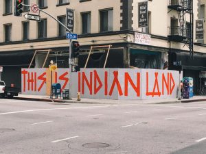
We’ve written about the importance of graffiti for contemporary Native artists many times here on the blog. In the hands of Native artists, painting with spray cans in public spaces is no petty act of vandalism but a profoundly political gesture. This is clearly demonstrated by Jaques Fragua who wrote “This Is Indian Land” in giant letters on a construction site in Downtown Los Angeles. The act of appropriation is performed in a spirit kindred to graffiti. For Native American artists it is about re-claiming what is rightfully theirs by symbolically taking back their land by illegally writing on it, or redefining images that have been made from an external point of view.

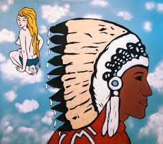
We haven’t written about Jaque Fragua on the blog before, so let’s continue on him. Besides graffiti, Fragua considers appropriation one of his artistic go-to’s. “The Big Chief” is for instance a commercial symbol that has become a recurring character throughout Fragua’s work. Fragua explains: “He’s a chief from a sign that’s near my reservation, at Big Chief Gas Station. If you’ve ever watched Breaking Bad, you’ve see that gas station. I lifted him and I’ve been putting him everywhere—he’s the Big Chief, right? When you put a mirror against another mirror, you start seeing the core of the truths.”

In another interview, Fragua explains the appeal of appropriation more in depth: ”Simply, it’s about imagery that continues to colonize us. By creating fine art out of these visuals and emphasizing the images ad nauseum, it creates the opposite effect. Sort of like Warhol’s soup cans.”  Fragua thus reappropriates his culture’s iconography in a way that conceptually subverts our overconsumption of misappropriated Native American images that has turned into stereotypes.

Some critics fear that appropriation as a artistic gesture has lost some of its meaning in a time when borrowing, quoting, stealing and copying is everyday practice to the point of being ubiquitous. However, for Native American artists, appropriation simply follows the rules of the game set by a white hegemony. It is the answer to a signifying practice already put in place. As such, appropriation is important now perhaps more than ever. With a president that casually refers to people of Native American heritage as “Pocahontas”, and a culture at large that hold it’s racial stereotypes dearly, appropriation as artistic weapon offers a way to strike back. Contemporary Native American artists turn to appropriation not to be trendy or edgy but out of urgency. It opens a line of dialogue that lets Native Americans have the last word on images that they were not in charge of in the first place and thus to let the public know what they think about them.

Further reading about cultural appropriation:

https://unsettlingamerica.wordpress.com/2011/09/16/cultural-appreciation-or-cultural-appropriation/

https://jezebel.com/5959698/a-much-needed-primer-on-cultural-appropriation 

http://nativeappropriations.com


About appropriation art:

https://www.artsy.net/article/artsy-editorial-the-art-of-copying-ten-masters-of-appropriation

https://www.thoughtco.com/appropriation-appropriation-art-183190 

Chris Pappan

CP_applesauceIt is with great delight that Kiva Gallery finds the face of Chris Pappan adorning the cover of the latest issue of Native Peoples Magazine. Pappan is one of the Gallery’s favourite artists and we are proud to have several of his works in our collection. A truly accomplished draftsman, Pappan brings a modern sensibility to the tradition of ledger art. He would rather be called “big city Indian” (he lives in Chicago) than Native American and this progressive stance shines through in his art.

Like many other contemporary artists – for instance Douglas Miles, Ryan Singer and Frank Buffalo Hyde – Pappan’s art engages with what I would call second-order representations. They are, in other words, not primarily trying to convey a “truth” about Native culture but are rather concerned with representations of representations – of movie stars and actors, and how Native culture has been represented by people outside of it. Needless to say, when representation of a culture lies in the hands of people who know nothing about it, the result is often skewed and misguided. Nevertheless, these images have entered the collective consciousness of popular culture, and the task many contemporary Native artists have taken upon themselves is to point to the fallacies of these images.

If we are to believe Michelle H. Raheja, this is far from an easy task. Raheja suggests in her book ”Reservation Reelism” that when the Bildhegemonic culture work its hardest to deny and suppress Native Americans, any evidence of their existence becomes cause for celebration. Hence for a Native American audience starved on images of their culture, the fact of visibility has sometimes overridden concerns about the hurtfulness of distorted representations. This could explain why many Native Americans of the older generation have taken even obviously negative representations and characters such as Tonto to heart. Simply put, it was all they had.

Pappan often relies on stereotypical imagery of Natives. Far from enabling a facile identification with these images, however, Pappan employs aesthetic strategies that make them slip from the viewer’s grasp. Pappan’s drawings often include distortions that disturb the proper reception of them. As Chris Pappan explains: “My images are distorted to reflect the distorted image of Indians in contemporary culture and the way Indians themselves are distorted by images.” When looking at a Pappan drawing, therefore, one gets the feeling that, according to the laws of perspective, it does not cohere. It’s as if a single figure is being viewed from different spatial positions simultaneously.

Bild 19There is art-historical precedence to this technique. Ever since the laws of perspective became an artistic institution, artists have liked to play around with them. The art of turning perspective on its head almost became a genre of painting unto itself and it became known as “anamorphosis”. Leonardo Da Vinci was a avid practitioner. Historically, anamorphic distortion in painting has been used to simultaneously present and disguise a content that some might regard as controversial. It was a way to sneak burlesque and sexual imagery as well as political commentary past a possibly censorious establishment. This was made possible by the way an anamorphic picture has to be viewed from a specific angle to make sense. From a frontal position, an anamorphic picture appears an incomprehensible mess. But viewed from a particular perspective, the content of the image clearly appears.

This historical background to anamorphosis serves Pappan’s purposes of subverting stereotypes well. It’s as if Pappan uses the device of distortion to suggest that beneath stereotypical imagery lies another reality. One that is only attainable by changing ones perspective and outlook on the world.

There is a poetry of instability and elusiveness to Pappan’s images. While rooted in past and possibly damaging representations, his art also suggest that these are not the final word. The image of the Native American is open to revision, and changing it is what a new generation of Native artists have set out to do.


Chris Pappan and his art can been seen at SWAIA – Santa Fe Indian Market August 18-24.